The map has different zoom levels: use mouse-wheel, page up/down or the buttons to change them. You can also tilt the map to match the display using the isometric map button.
On the map, water is blue and lower land is darker than higher land. The currently visible part of the world on the screen is indicated by a yellow-square outline. To move this field of vision across the world, left-click on map at desired location or left-click-drag the yellow-square. With right-click drag you can move the area in the map window without using the scrollbars.
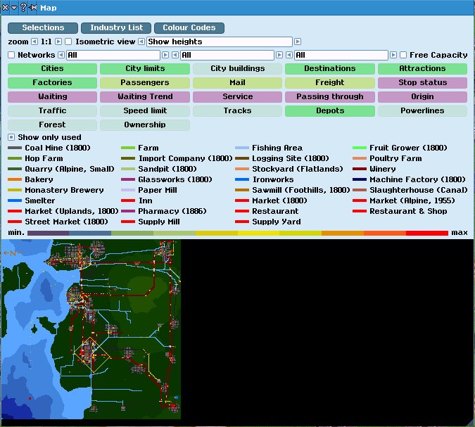
Using the selection button many additional informations can be overlaid. Those fall in three groups. White and yellow buttons are exclusive and will disable any other white option. Green buttons are for overlays that can be combined with any other. The third group are the red buttons for stops. From this stop group only one can be active at a time.
The following options exist:
Cities names of
urban areas.
City Limits show the city limits; new houses and roads are only built inside the city limits.
No. of buildings colors each city building according to its level. The level determines the probability to generate passengers or mail here.
Destinations If a town selected, this option overlays the current passenger destinations (similar to the small map in the
City Information.)
Attractions draws circles on the location of tourist attractions. The color and size will indicate the amount of traffic this tourist attractions generates (use min-max scale).
Factories: highlights
industry (consumers and suppliers). If this overlay is active and the mouse pointer hovers over an
industry on map, it will show the name and white lines linking customers; hold down [Shift] to show red line to suppliers. The color is the color of the industry can be seen fro the
Industry List.
Passengers colors the catchment area for passengers by
Stops with the color of the respective owner. If the network overlay is active, it will only show passenger connections.
Mail colors catchment area for mail by
Stops with the color of the respective owner. If the network overlay is active, it will only show passenger connections.
Freightlevel of goods and passengers transported on alls ways (uses min-max scale). If the network overlay is active, it will only show freight connections.
Stop Status (and all following red options) highlight the
stops by circles.
Stop Status color indicate how overcrowded a stop is. The same colour is shown in status-colour-bars in
Station List, in the
Stop Information,
Line Management and finally in the color-bar above the name of a stop. The size indicates the capacity of a stop for passengers.
Waiting shows the amount of passengers, mail and goods waiting for transport at a
Stop. Color as and size indicate the amount waiting (uses min-max scale).
Queing shows how much the amount of passengers, mail and goods waiting has changed within this month. The size indicates the total change, while the colors are green for decreasing and red for increasing (uses min-max scale).
Service color and size indicate how many
vehicles served a station in this months (uses min-max scale).
Transfers size and color indicate how many arrived/departed at a station (uses min-max scale).
Origin color and size show how many passengers and mail wanted to start their journey at a
Stop, i.e. the sum of happy, unhappy and no route passengers (uses min-max scale).
Traffic colors ways by the number of vehicles passed within a month (uses min-max scale).
Tracks rail amd tram tracks, bridges, and tunnels are shown as white (red if electrified). Signals are shown as yellow.
Speed Limit colors all ways with respect to their maximum speed allowed (uses min-max scale).
Depots highlights
depots. Colors indicate transport types: ship, yellow; road, orange; rail, red; aircraft, green; trams, blue; and monorail, grey.
Powerlines show the load on
power transmission lines.
Forest shows forests in bright green.
Ownership colors all things on the map with the
color of their owner (orange for unowned).